

CSS实现进度条和订单进度条的示例
作者:互联网
2026-04-13
 HTML教程
最近半个月为了期末考试,可要了学渣我半瓶血啊!今天本该好好复习的,可是状态不好,就随便找点乐子玩一玩,于是乎就想起之前面试时面试官给的一道题(见标题),那就弄点简单的小玩意给自己洗洗脑咯。
简单地效果图如下:
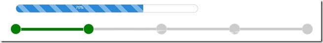
CSS实现进度条:
html结构:
70%
css样式:
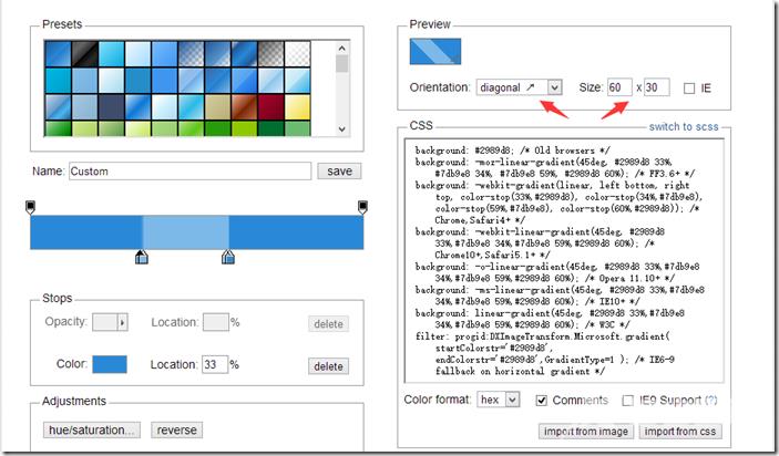
#progress{ width: 50%; height: 30px; border:1px solid #ccc; border-radius: 15px; margin: 50px 0 0 100px; overflow: hidden; box-shadow: 0 0 5px 0px #ddd inset;}#progress span { display: inline-block; width: 70%; height: 100%; background: #2989d8; /* Old browsers */ background: -moz-linear-gradient(45deg, #2989d8 33%, #7db9e8 34%, #7db9e8 59%, #2989d8 60%); /* FF3.6+ */ background: -webkit-gradient(linear, left bottom, right top, color-stop(33%,#2989d8), color-stop(34%,#7db9e8), color-stop(59%,#7db9e8), color-stop(60%,#2989d8)); /* Chrome,Safari4+ */ background: -webkit-linear-gradient(45deg, #2989d8 33%,#7db9e8 34%,#7db9e8 59%,#2989d8 60%); /* Chrome10+,Safari5.1+ */ background: -o-linear-gradient(45deg, #2989d8 33%,#7db9e8 34%,#7db9e8 59%,#2989d8 60%); /* Opera 11.10+ */ background: -ms-linear-gradient(45deg, #2989d8 33%,#7db9e8 34%,#7db9e8 59%,#2989d8 60%); /* IE10+ */ background: linear-gradient(45deg, #2989d8 33%,#7db9e8 34%,#7db9e8 59%,#2989d8 60%); /* W3C */ filter: progid:DXImageTransform.Microsoft.gradient( startColorstr='#2989d8', endColorstr='#2989d8',GradientType=1 ); /* IE6-9 fallback on horizontal gradient */ background-size: 60px 30px; text-align: center; color:#fff;}对于进度条,其中的进度颜色也可以是纯色,若想要用渐变的话,可以到此网站:http://www.colorzilla.com/gradient-editor/ ,这样完成渐变效果就变得非常简单,跟用PS的操作是一样一样的。将背景设置为渐变后,还需要设置background-size,这样才能实现重复效果:
css实现订单进度条:
html结构:
css样式:
#progressBar{ width: 80%; height: 50px; position: relative; margin: 50px 0 0 100px;}#progressBar div{ width: 100%; height: 10px; position: absolute; top:50%; left: 0; margin-top:-20px; border:1px solid #ddd; background: #ccc;}#progressBar div span{ position: absolute; display: inline-block; background: green; height: 10px; width: 25%;}#progressBar>span{ position: absolute; top:0; margin-top: -10px; width: 40px; height: 40px; border:2px solid #ddd; border-radius: 50%; background: green; margin-left: -20px; color:#fff;}#progressBar>span:nth-child(1){ left: 0%;}#progressBar>span:nth-child(2){ left: 25%; background:green;}#progressBar>span:nth-child(3){ left: 50%; background:#ccc;}#progressBar>span:nth-child(4){ left: 75%; background:#ccc;}#progressBar>span:nth-child(5){ left: 100%; background:#ccc;}然后用JS就能实现动态的进度条啦!
PS:CSS样式没怎么优化,然后调试CSS代码时发现第一个圆的样式不起作用,所以才将默认背景色改成绿色,希望能帮我解决这个小BUG的博友留言一下哟,谢谢 !!!
原文链接:https://www.cnblogs.com/jr1993/p/4598630.html
以上就是CSS实现进度条和订单进度条的示例的详细内容,更多关于css实现进度条的资料请关注本站其它相关文章!
相关推荐
