

CSS实现的圆形进度栏
作者:互联网
2026-04-12
 HTML教程
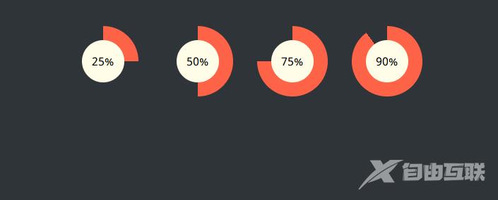
实现效果
实现代码
html
css
@import url(https://fonts.googleapis.com/css?family=Noto+Sans);body { padding: 30px 0; background-color: #2f3439; font-family: "Noto Sans", sans-serif;}.wrap { width: 600px; margin: 0 auto;}/* ------------------------------------- * Bar container * ------------------------------------- */.progress-radial { float: left; margin-right: 30px; position: relative; width: 100px; height: 100px; border-radius: 50%; border: 2px solid #2f3439; background-color: tomato;}/* ------------------------------------- * Optional centered circle w/text * ------------------------------------- */.progress-radial .overlay { position: absolute; width: 60px; height: 60px; background-color: #fffde8; border-radius: 50%; margin-left: 20px; margin-top: 20px; text-align: center; line-height: 60px; font-size: 16px;}/* ------------------------------------- * Mixin for progress-% class * ------------------------------------- */.progress-0 { background-image: linear-gradient(90deg, #2f3439 50%, rgba(0, 0, 0, 0) 50%, rgba(0, 0, 0, 0)), linear-gradient(90deg, #ff6347 50%, #2f3439 50%, #2f3439);}.progress-5 { background-image: linear-gradient(90deg, #2f3439 50%, rgba(0, 0, 0, 0) 50%, rgba(0, 0, 0, 0)), linear-gradient(108deg, #ff6347 50%, #2f3439 50%, #2f3439);}.progress-10 { background-image: linear-gradient(90deg, #2f3439 50%, rgba(0, 0, 0, 0) 50%, rgba(0, 0, 0, 0)), linear-gradient(126deg, #ff6347 50%, #2f3439 50%, #2f3439);}.progress-15 { background-image: linear-gradient(90deg, #2f3439 50%, rgba(0, 0, 0, 0) 50%, rgba(0, 0, 0, 0)), linear-gradient(144deg, #ff6347 50%, #2f3439 50%, #2f3439);}.progress-20 { background-image: linear-gradient(90deg, #2f3439 50%, rgba(0, 0, 0, 0) 50%, rgba(0, 0, 0, 0)), linear-gradient(162deg, #ff6347 50%, #2f3439 50%, #2f3439);}.progress-25 { background-image: linear-gradient(90deg, #2f3439 50%, rgba(0, 0, 0, 0) 50%, rgba(0, 0, 0, 0)), linear-gradient(180deg, #ff6347 50%, #2f3439 50%, #2f3439);}.progress-30 { background-image: linear-gradient(90deg, #2f3439 50%, rgba(0, 0, 0, 0) 50%, rgba(0, 0, 0, 0)), linear-gradient(198deg, #ff6347 50%, #2f3439 50%, #2f3439);}.progress-35 { background-image: linear-gradient(90deg, #2f3439 50%, rgba(0, 0, 0, 0) 50%, rgba(0, 0, 0, 0)), linear-gradient(216deg, #ff6347 50%, #2f3439 50%, #2f3439);}.progress-40 { background-image: linear-gradient(90deg, #2f3439 50%, rgba(0, 0, 0, 0) 50%, rgba(0, 0, 0, 0)), linear-gradient(234deg, #ff6347 50%, #2f3439 50%, #2f3439);}.progress-45 { background-image: linear-gradient(90deg, #2f3439 50%, rgba(0, 0, 0, 0) 50%, rgba(0, 0, 0, 0)), linear-gradient(252deg, #ff6347 50%, #2f3439 50%, #2f3439);}.progress-50 { background-image: linear-gradient(-90deg, #ff6347 50%, rgba(0, 0, 0, 0) 50%, rgba(0, 0, 0, 0)), linear-gradient(270deg, #ff6347 50%, #2f3439 50%, #2f3439);}.progress-55 { background-image: linear-gradient(-72deg, #ff6347 50%, rgba(0, 0, 0, 0) 50%, rgba(0, 0, 0, 0)), linear-gradient(270deg, #ff6347 50%, #2f3439 50%, #2f3439);}.progress-60 { background-image: linear-gradient(-54deg, #ff6347 50%, rgba(0, 0, 0, 0) 50%, rgba(0, 0, 0, 0)), linear-gradient(270deg, #ff6347 50%, #2f3439 50%, #2f3439);}.progress-65 { background-image: linear-gradient(-36deg, #ff6347 50%, rgba(0, 0, 0, 0) 50%, rgba(0, 0, 0, 0)), linear-gradient(270deg, #ff6347 50%, #2f3439 50%, #2f3439);}.progress-70 { background-image: linear-gradient(-18deg, #ff6347 50%, rgba(0, 0, 0, 0) 50%, rgba(0, 0, 0, 0)), linear-gradient(270deg, #ff6347 50%, #2f3439 50%, #2f3439);}.progress-75 { background-image: linear-gradient(0deg, #ff6347 50%, rgba(0, 0, 0, 0) 50%, rgba(0, 0, 0, 0)), linear-gradient(270deg, #ff6347 50%, #2f3439 50%, #2f3439);}.progress-80 { background-image: linear-gradient(18deg, #ff6347 50%, rgba(0, 0, 0, 0) 50%, rgba(0, 0, 0, 0)), linear-gradient(270deg, #ff6347 50%, #2f3439 50%, #2f3439);}.progress-85 { background-image: linear-gradient(36deg, #ff6347 50%, rgba(0, 0, 0, 0) 50%, rgba(0, 0, 0, 0)), linear-gradient(270deg, #ff6347 50%, #2f3439 50%, #2f3439);}.progress-90 { background-image: linear-gradient(54deg, #ff6347 50%, rgba(0, 0, 0, 0) 50%, rgba(0, 0, 0, 0)), linear-gradient(270deg, #ff6347 50%, #2f3439 50%, #2f3439);}.progress-95 { background-image: linear-gradient(72deg, #ff6347 50%, rgba(0, 0, 0, 0) 50%, rgba(0, 0, 0, 0)), linear-gradient(270deg, #ff6347 50%, #2f3439 50%, #2f3439);}.progress-100 { background-image: linear-gradient(90deg, #ff6347 50%, rgba(0, 0, 0, 0) 50%, rgba(0, 0, 0, 0)), linear-gradient(270deg, #ff6347 50%, #2f3439 50%, #2f3439);}以上就是CSS实现的圆形进度栏的详细内容,更多关于CSS实现圆形进度栏的资料请关注本站其它相关文章!
相关推荐
专题
+ 收藏
+ 收藏
+ 收藏
+ 收藏
+ 收藏
+ 收藏
最新数据

相关文章
AI精选
精选
从 Prompt 到 Harness:AI 工程的三重进化,你在哪一层?
精选
这本 LLM 应用书,我翻了 5 遍:RAG 与 Agent 开发实战指南
精选
现在面试 AI 相关问题,不把底层原理扒得明明白白,真的分分钟被问麻 | 沸点周刊 4.16
精选
无人机拍叶片→AI找缺陷:CEA-DETR改进RT-DETR做风电叶片表面缺陷检测,mAP50达89.4%
精选
学习编辑自己的 Skill:如何书写一个合格的 AI 工作流指令
精选
替你筛完70个Skills!手把手教你调教Hermes Agent!
精选
踩坑3天后,我把公司的AI接口全换成了多模型路由——GPT-6和Claude Opus 4.7同时上线的这周
精选
一个问题,GPT-6是否值得期待???