

css如何制作圆
作者:互联网
2026-04-12
 HTML教程
在css中,可以利用border-radius属性来制作圆;border-radius属性可以为元素添加圆角边框,只需要给宽高相同的正方形元素的设置“border-radius: 100%;”样式即可。

本教程操作环境:windows7系统、CSS3&&HTML5版、Dell G3电脑。
p+Css制作四分之一圆主要是使用Css3.0中的border-radius这个圆角隐藏属性.利用这一属性,我们可以画圆,画半圆,四分之三圆,四分之一圆等.以后我会更新……
如何使用border-radius属性,下面是border-radius属性最基本的使用方法:
.round { border-radius: 5px; /* 所有角都使用半径为5px的圆角,此属性为CSS3标准属性 */ -moz-border-radius: 5px; /* Mozilla浏览器的私有属性 */ -webkit-border-radius: 5px; /* Webkit浏览器的私有属性 */ border-radius: 5px 4px 3px 2px; /* 四个半径值分别是左上角、右上角、右下角和左下角 */}1、用border-radius画圆:
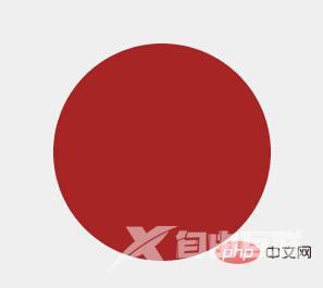
#circle { width: 200px; height: 200px; background-color: #a72525; -webkit-border-radius: 100px; /*-webkit-border-radius: 100%;*/}仔细想想,一个正方形(200*200),里面最大的圆是的半径是:100.
2.空心圆代码:空心圆其实就是只有边框,空心部分填上其他颜色:
#circle { width: 200px; height: 200px; background-color: #efefef; /* Can be set to transparent */ border: 3px #a72525 solid; -webkit-border-radius: 100px;}
同理虚线圆代码:
#circle { width: 200px; height: 200px; background-color: #efefef; /* Can be set to transparent */ border: 3px #a72525 dashed; -webkit-border-radius: 100px 100px 100px 100px;}
3.半圆和四分之一圆代码:
#quartercircle { width: 200px; height: 200px; background-color: #a72525; -webkit-border-radius: 200px 0 0 0;}Document 点选

解释:
-moz(例如 -moz-border-radius)用于Firefox
-webkit(例如:-webkit-border-radius)用于Safari和Chrome
其中border-radius各个浏览器支持情况如表:
(学习视频分享:css视频教程)
【文章转东台网页制作公司 http://www.1234xp.com/dongtai.html 网络转载请说明出处】
相关推荐
