

解决纯css写三角形在firefox下的锯齿问题
作者:互联网
2026-03-25
 HTML教程
相信很多人都用过利用border来实现小三角箭头,百度一下,这类的文章多如牛毛,这里我还是啰嗦点把常用的方法陈列出来:
CSS Code复制内容到剪贴板- .triangle_border_up{
- width:0;
- height:0;
- border-width:030px30px;
- border-style:solid;
- border-color:transparenttransparent#333;/*透明透明灰*/
- margin:40pxauto;
- position:relative;
- }
或者:
CSS Code复制内容到剪贴板- .border_bottom{
- width:0;
- height:0;
- border:10pxsolidtransparent;
- border-bottom:11pxsolid#000;
- }
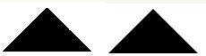
这样写都有个问题,就是在firefox里面会有锯齿,看着就不爽,如下左图,这是放大后的,三角越小锯齿越明显,其他浏览器很润滑,下面的右图。
在网上搜索很少有人提到,有提到的好像也没实际解决,下面介绍个非常简单的方法,就是给有颜色的那个border宽度多加一个像素:
CSS Code复制内容到剪贴板- .border_bottom{
- width:0;
- height:0;
- border:50pxsolidtransparent;
- border-bottom:51pxsolid#000;
- }
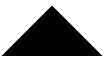
是不是很滑....
以上就是为大家分享的文章,希望对大家的学习有所帮助。
原文:http://www.cnblogs.com/hutuzhu/p/4169252.html
相关推荐
